British Airways
British Airways
What do customers prioritise when booking flights?
Working with DesignStudio as Lead Product Designer, I helped redesign the end-to-end booking experience for British Airways.
The work brought together clearer flight comparison, more visible upgrade options and a visual experience inspired by each destination.
The redesigned experience launched, with improved conversion reported following the work.
What do customers prioritise when booking flights?
Working with DesignStudio as Lead Product Designer, I helped redesign the end-to-end booking experience for British Airways.
The work brought together clearer flight comparison, more visible upgrade options and a visual experience inspired by each destination.
The redesigned experience launched, with improved conversion reported following the work.
What do customers prioritise when booking flights?
Working with DesignStudio as Lead Product Designer, I helped redesign the end-to-end booking experience for British Airways.
The work brought together clearer flight comparison, more visible upgrade options and a visual experience inspired by each destination.
The redesigned experience launched, with improved conversion reported following the work.
The role
As Lead Product Designer, I worked with the DesignStudio team on the booking journey, including the transition from search to results, the presentation of flight information and the integration of upgrade options.
The role
As Lead Product Designer, I worked with the DesignStudio team on the booking journey, including the transition from search to results, the presentation of flight information and the integration of upgrade options.
The role
As Lead Product Designer, I worked with the DesignStudio team on the booking journey, including the transition from search to results, the presentation of flight information and the integration of upgrade options.
Design principles
Make comparison easier
The website should be easy to read and understand, witGive flight times, duration, stops and pricing a consistent hierarchy so customers can scan their options.
h a clear hierarchy of information and a simple navigation structure.
Brand consistency
The website should feel unmistakably British Airways, bringing its contemporary British identity, premium service and distinctive visual language consistently across every touchpoint.
Make upgrades understandable
Present travel classes and additional options alongside the flight decision, with a clear relationship between price and what customers receive.
Design principles
Make comparison easier
The website should be easy to read and understand, witGive flight times, duration, stops and pricing a consistent hierarchy so customers can scan their options.
h a clear hierarchy of information and a simple navigation structure.
Brand consistency
The website should feel unmistakably British Airways, bringing its contemporary British identity, premium service and distinctive visual language consistently across every touchpoint.
Make upgrades understandable
Present travel classes and additional options alongside the flight decision, with a clear relationship between price and what customers receive.
Design principles
Make comparison easier
The website should be easy to read and understand, witGive flight times, duration, stops and pricing a consistent hierarchy so customers can scan their options.
h a clear hierarchy of information and a simple navigation structure.
Brand consistency
The website should feel unmistakably British Airways, bringing its contemporary British identity, premium service and distinctive visual language consistently across every touchpoint.
Make upgrades understandable
Present travel classes and additional options alongside the flight decision, with a clear relationship between price and what customers receive.
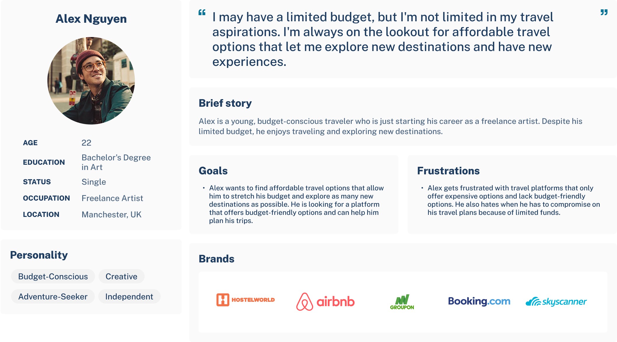
Personas


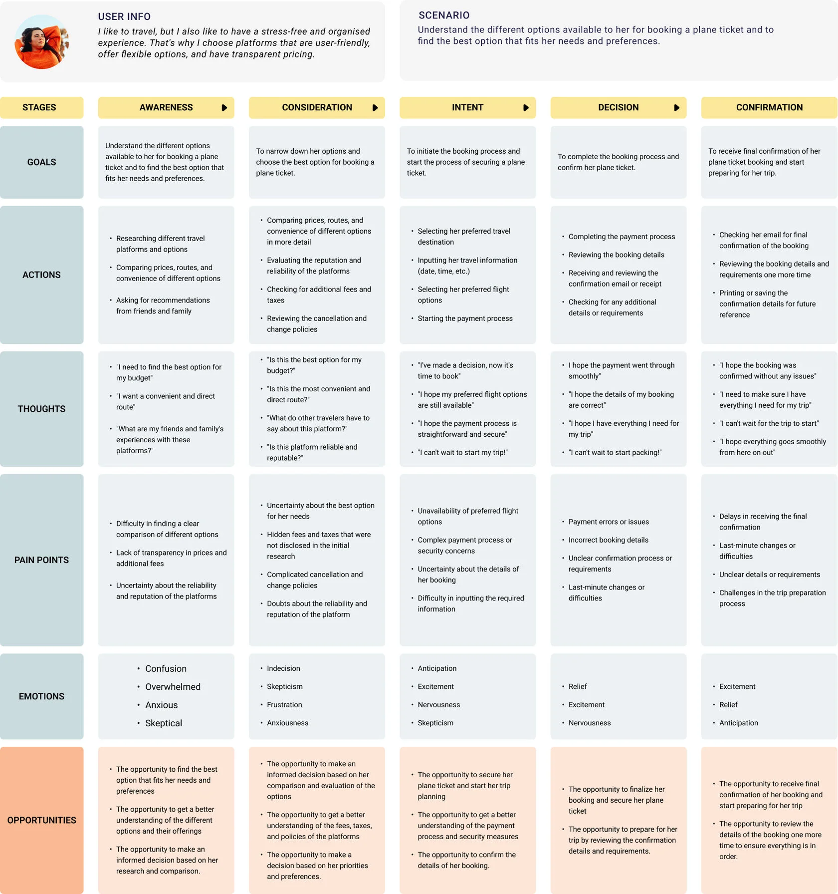
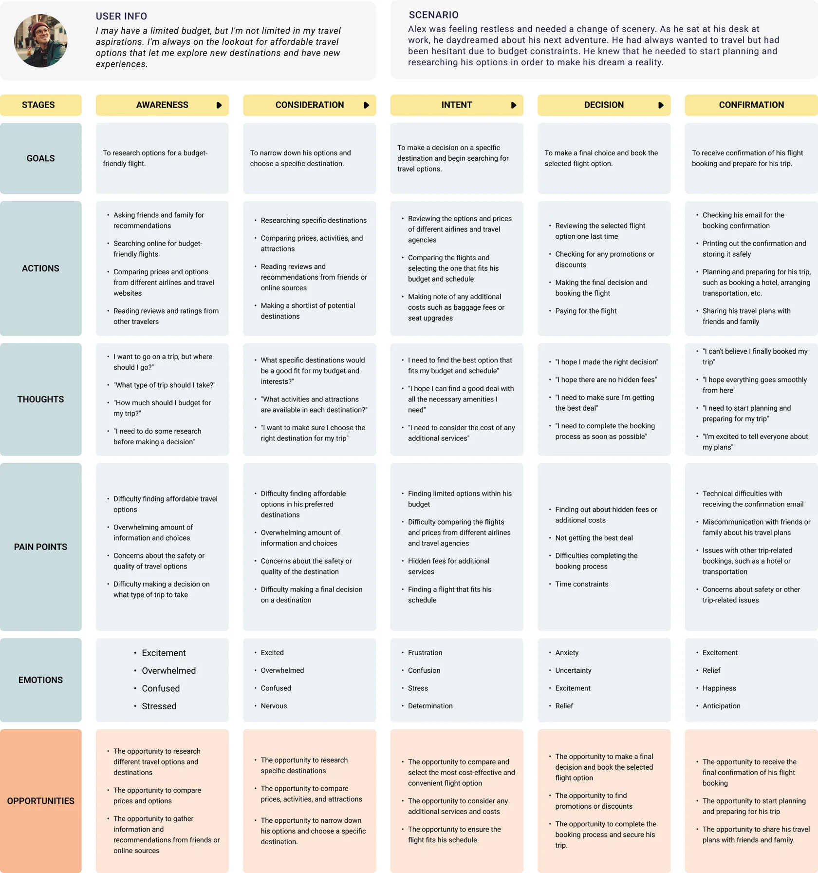
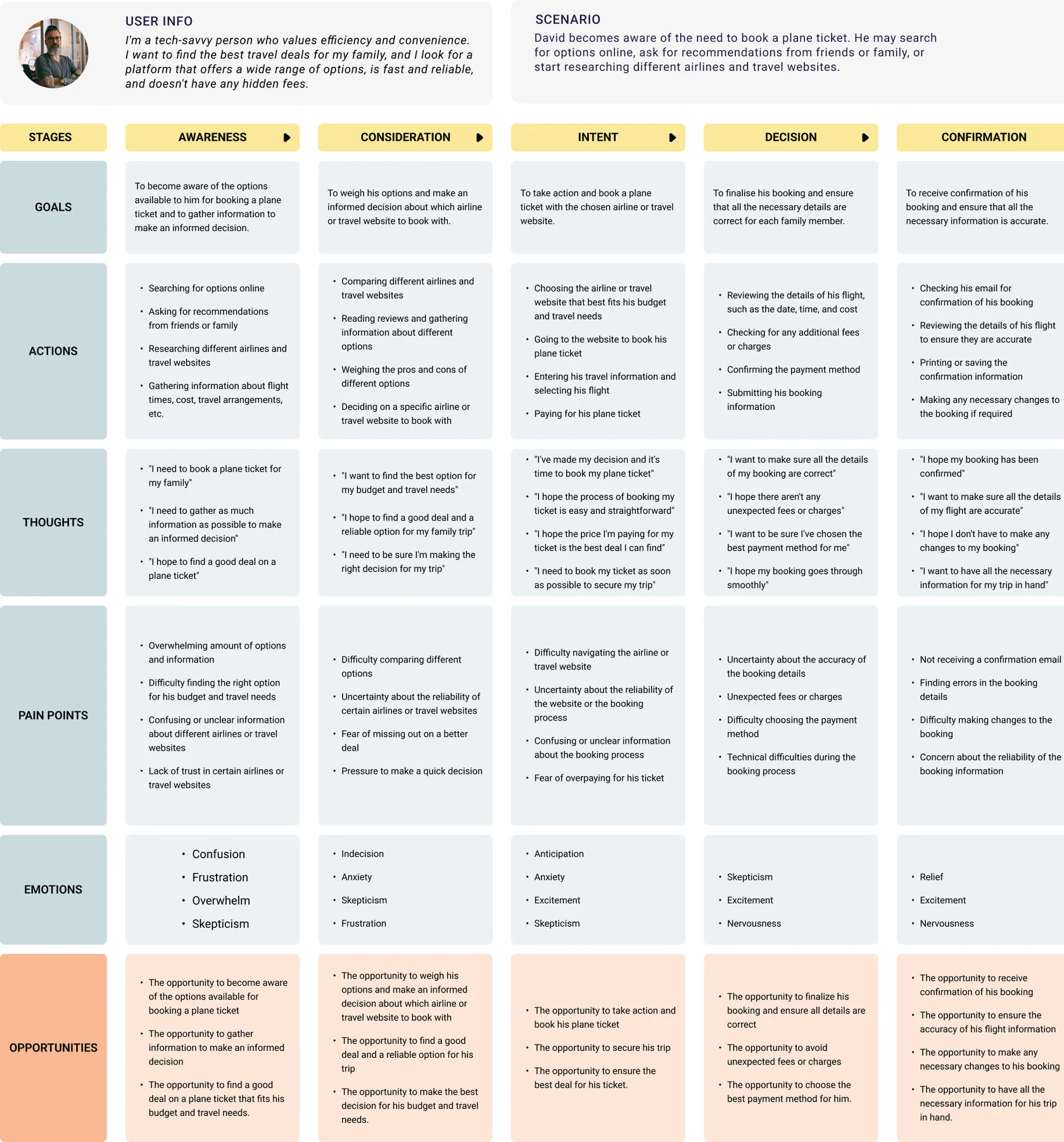
Customer journey map
The booking journey
Adding positive friction to down times
Adding positive friction to down times
Once users hit “Search” on the destination selector, we wanted to immerse them in a unique “destination world.” Using pre-loaded imagery for each location, we analyse its colour palette and generate a blurred colour halo that follows the user throughout the booking journey.
We also rethought the typical waiting time involved in fetching available flights. While results load in the background, users are presented with poems or famous quotes inspired by their destination, layered over its colour world.
This also introduces an element of “good friction.” Although results can often be returned almost instantly, we discovered that users perceived results as more valuable and trustworthy when they took slightly longer to appear. Rather than optimising purely for speed, we turned those few extra moments into part of the experience.
The result is a search journey that feels different every time, more considered, immersive and tailored to the destination.
Once users hit “Search” on the destination selector, we wanted to immerse them in a unique “destination world.” Using pre-loaded imagery for each location, we analyse its colour palette and generate a blurred colour halo that follows the user throughout the booking journey.
We also rethought the typical waiting time involved in fetching available flights. While results load in the background, users are presented with poems or famous quotes inspired by their destination, layered over its colour world.
This also introduces an element of “good friction.” Although results can often be returned almost instantly, we discovered that users perceived results as more valuable and trustworthy when they took slightly longer to appear. Rather than optimising purely for speed, we turned those few extra moments into part of the experience.
The result is a search journey that feels different every time, more considered, immersive and tailored to the destination.
New York
Istanbul
Bali
Singapore
New York
Istanbul
Bali
Singapore
The search results page
We reorganised the results around the information customers needed to evaluate a flight: departure and arrival times, duration, stops and price.
A consistent layout supported comparison across flights and travel classes. Upgrade options were integrated into the results experience, allowing customers to consider them alongside their initial selection.
The commercial objective was to make relevant upgrades easier to discover while keeping the main booking task clear.
Easier discovery= Increase in upgrade journey conversions.

The search results page
We reorganised the results around the information customers needed to evaluate a flight: departure and arrival times, duration, stops and price.
A consistent layout supported comparison across flights and travel classes. Upgrade options were integrated into the results experience, allowing customers to consider them alongside their initial selection.
The commercial objective was to make relevant upgrades easier to discover while keeping the main booking task clear.
Easier discovery= Increase in upgrade journey conversions.
The search results page
We reorganised the results around the information customers needed to evaluate a flight: departure and arrival times, duration, stops and price.
A consistent layout supported comparison across flights and travel classes. Upgrade options were integrated into the results experience, allowing customers to consider them alongside their initial selection.
The commercial objective was to make relevant upgrades easier to discover while keeping the main booking task clear.
Easier discovery= Increase in upgrade journey conversions.
Summary
Once users reached the flight results, we redesigned the experience around clearer comparison and stronger commercial opportunities. Flight information was simplified and prioritised, making timings, duration, stops and pricing easier to scan and reducing the cognitive load involved in choosing a flight.
We also introduced a dedicated upsell area directly within the results experience, surfacing relevant upgrades and additional products at the point where users were already considering their options. Rather than interrupting the journey later, these opportunities became a natural part of flight selection.
Together, the clearer hierarchy, easier comparison and better-timed upsell opportunities helped users make decisions with greater confidence, improving progression through the booking funnel while increasing conversion and ancillary revenue.

See more
The booking journey
Once users hit “Search” on the destination selector, we wanted to immerse them in a unique “destination world.” Using pre-loaded imagery for each location, we analyse its colour palette and generate a blurred colour halo that follows the user throughout the booking journey.
We also rethought the typical waiting time involved in fetching available flights. While results load in the background, users are presented with poems or famous quotes inspired by their destination, layered over its colour world.
This also introduces an element of “good friction.” Although results can often be returned almost instantly, we discovered that users perceived results as more valuable and trustworthy when they took slightly longer to appear. Rather than optimising purely for speed, we turned those few extra moments into part of the experience.
The result is a search journey that feels different every time, more considered, immersive and tailored to the destination.
New York
Istanbul
Bali
SIngapore
Adding positive friction to down times





If you don't want to scroll all the way to the top,

If you don't want to scroll all the way to the top,